Thursday, December 1, 2011
Clancy
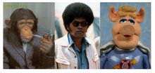
This is a piece I did recently for Stephen Silver's new iPad app & upcoming book. Stephen has assembled some terrific models, and photographed them in various costumes and poses for artists' reference. A great idea, and sure to be a must-have book. I call this guy "Clancy", 'cause that's just what he looks like to me.
...and some of the sketches that were done before deciding on the final pose
Thursday, May 26, 2011
Rockin' For The Arts 2011

Recently finished the poster for this year's Rockin' For The Arts concert (coming up, June 3rd, in case you're in the area)!
4 things I like about this gig:
1) Kids playing musical instruments- always a good thing.
2) All funds raised support arts in the school- very cool.
3) Making music with my friends- one of my all-time favorite activities.
4) It gives me an excuse to design a poster every year.
If you're around, come on out for food, fun, & rock & roll! It's a great event, and I'll be funkin' out in every way.
Hey- that dude in the post underneath will be playing guitar! Hows that for blog synergy?
Monday, April 11, 2011
One from the archives

This is a cover I did for Nickelodeon Magazine's special Fairly Oddparents issue several years ago. I roughed out half-a-dozen or so thumbnails until the publisher was happy with the design (if I find those thumbnails, I'll add them to this post), the image was then cleaned up by Ray Leong, and I did the painting. First cover I ever did, and I must say- seeing your artwork on the magazine racks at your Barnes & Noble is pretty cool!
Monday, February 28, 2011
Anthony Zierhut
This is an image I made for my friend Anthony Zierhut's birthday. He plays some mean blues & slide guitar... and he looks like that, kind of...He's also a terrific artist! You can check out his sketchblog here.
Friday, February 4, 2011
Extras, Miscellaneous, & Whatnot
In addition to designing the central characters involved in a particular storyboard, the character designer has several other responsibilities. Here are some examples of the work that goes into a given assignment: A sampling of incidental background characters, special character poses done to help guide the overseas animators, and a special mouthmchart, designed to accommodate a specific line reading (in this case, by Jerry Trainer- the voice of Dudley Puppy). All of these images were created for the same TUFF Puppy episode: "Doom Mates".


Wednesday, January 26, 2011
TUFF Puppy: Sally Mander

This is one of the earliest designs I did when I was assigned to develop TUFF Puppy. I thought the receptionist for an organization like T.U.F.F. would have to be a real multitasker, so I put her prehensile tongue & tail to use. At the time I was gunning for a 60's look for the show, which explains the pillbox hat. This character seems to have disappeared after delivering one line in the pilot episode (which is why the model sheet was never refined & cleaned up). Ah well- it was fun while she lasted!
Tuesday, December 21, 2010
Wednesday, December 8, 2010
Cactus + Ukulele = ?
So... I was approached by a ukulele group from Tucson AZ, to design a mascot/logo for their club- "The Saguaro Strummers". It was suggested that something involving a ukulele and a cactus would be in order (turns out a saguaro is a cactus), and since they sought me out in response to seeing my Tampa Bay Ukulele Society logo (which can be seen a few posts down), I guessed they would like something character-oriented rather than an abstract pairing of the two.
I have to say putting the two together was not as easy as I hoped, but I ultimately came up with this idea- going for a little bit of a retro-kitsch-Trader-Vics-Menu vibe, and they seem to be pleased with it. Hope you like it.
Wednesday, November 3, 2010
TUFF Puppy: Sally Mander
I thought this would be an interesting character in TUFF- the multitasking,
Saturday, October 23, 2010
TUFF Puppy: The Chief
This might be my favorite of my Tuff Puppy designs- the Chief- the Flea who runs TUFF (Turbo Undercover Fighting Force). I wanted Danny Devito for his voice... I pictured him with a cigar, but we couldn't do that for obvious reasons, so I gave him a churro instead. I figured it was his substitute as he struggled to give up cigars. You even still get the falling ash effect from the cinnamon-sugar.
TUFF Puppy: The Chief
This might be my favorite of my Tuff Puppy designs- the Chief- the Flea who runs TUFF (Turbo Undercover Fighting Force). I wanted Danny Devito for his voice I pictured him with a cigar, but we couldn't do that for obvious reasons, so I gave him a churro instead. I figured it was his substitute as he struggled to give up cigars. You even still get the falling ash effect from the cinnamon-sugar.
Saturday, October 16, 2010
TUFF Puppy: The Chameleon
Here is one of the villains I designed for the new show- Tuff Puppy. Included are some of the special poses & expressions from the Chameleon episode that has already hit the airwaves. I especially enjoy this character, with his Peter Lorre voice (Provided by Daran Norris), his wild, independent eyes, and his ability to transform into any and everything. Hope you like it!
The Chameleon

The Chameleon
Monday, October 11, 2010
TUFF Puppy: Kitty Katswell
Well, the show I've been working on has finally aired, so I can share some of the work I've been doing more recently. I'm excited about this project because it's my first opportunity to design the main character line-up for a new show. The character of Dudley was designed by show creator Butch Hartman, but I was asked to design the balance of the lineup: Kitty Katswell, The Chief, Keswick, Snaptrap, Dudley's mom, etc. These characters were all initially designed over one weekend, although the turns, mouthcharts, and expressions were done later. Here is the first character I did for the show: Kitty Katswell.I tried to push for a mod sort of sexy/sophisticated 60's look. Her trenchcoat was later replaced with a jumpsuit, and her hair was made a little less graphic. Other than that- she remains pretty much the way you see her here.

Kitty Katswell

Kitty Katswell
Sunday, October 10, 2010
T.U.F.F. Puppy- Kitty Katswell
Well, the show I've been working on has aired at last, so I can finally share some of the work I've been doing. I'm excited about this project because it's my first opportunity to design the main character line-up for a show. (except for Dudley, who was designed by show creator Butch Hartman.
Sunday, May 30, 2010
"Rockin' For The Arts" 2010
Just finished the poster for this years "Rockin' For the Arts" concert! This concert is a fundraiser for arts programs in our public elementary school. Through this and other fundraisers, we've added a dedicated art bungalow to our campus, with a full-time art teacher, music classes, dance, creative drama... and because we are raising the money for these programs ourselves, they haven't been decimated by the state budget cutbacks. I hope you like the posters (I'll include the designs for the past two years, too), and if you're in the Glendale area on Friday June 11th, come on by and rock with us! I'll have my electric, telecaster-style ukulele, and I'm not afraid to plug it in!


Monday, May 24, 2010
Ukulele Mascot/Logo

Well, I just finished designing (the first incarnation of) a mascot & logo for The Tampa Bay Ukulele Society. Steve Boisen, of The Barnkickers is the organizer, and while I'm on the subject, I highly recommend the CD "Square Pegs & Round Holes". It was produced by Steve, and all the profits from it's sale go to benefit the American Aspergers Association. Plus- it's a great CD!
Well, here's to the TBUS!
Saturday, March 27, 2010
My Volunteer Life

I think it's important to give back to the community, and I spend a lot of time volunteering for various local organizations... the theatre group that I spend a lot of time with is currently producing one of my favorite stage comedies: The Foreigner, by Larry Shue. I agreed to do the graphic for the program, and for publicity, etc... and here is what I came up with. The play centers around an Englishman, who winds up at a fishing lodge in the American south. His only desire is to be left alone, but he inadvertently becomes privy to some pretty nasty plans by less-than-savory locals, and finds himself at the heart of a sinister plot, and at a personal crossroads. The play balances some pretty serious subject matter with a great deal of hilarity. The result is definitely worthwhile. If you have an opportunity to see a production, I highly recommend it!
Tuesday, March 23, 2010
Incidental Thugs
I'm in the slightly awkward position of working on a show that hasn't aired yet, which makes it difficult to find anything current to post. Here are a couple of drawings I did a few weeks ago, and I just learned this sequence was cut, so here you go! These kinds of crowds can be intimidating to start, but with our production schedule racing along at locomotive speed, there's only one viable approach for me- one pass to rough it out, and one pass to tie it down. There's no time for agonizing, so there's always the desire for more time to go back & finesse, but on the other hand it's a great exercise in hitting the ground running, & following your first impulse. In the first image, the thugs are surrounding a character who is too small for us to see... in the second he blasts out of their midst...


Thursday, March 18, 2010
Baby Poof and Foop Comic-Con Posters
Here's something a little different. I haven't been posting much, partly because I figure people are likely getting tired of seeing Fairly Oddparents posts, and the show I'm currently working on hasn't aired, so there's not much I can show from that.
Here are two posters I did as a promotion for last years Comic-Con in San Diego. One is of Baby Poof, and the other, his anti-fairy nemesis- Foop. What was different about the assignment is that I got to do everything, from concept to design, to the rough drawing, to clean-up, to final color. These are obviously very simple in concept, but they were very gratifying nonetheless.

Here are two posters I did as a promotion for last years Comic-Con in San Diego. One is of Baby Poof, and the other, his anti-fairy nemesis- Foop. What was different about the assignment is that I got to do everything, from concept to design, to the rough drawing, to clean-up, to final color. These are obviously very simple in concept, but they were very gratifying nonetheless.

Tuesday, May 5, 2009
Subscribe to:
Posts (Atom)